
Why Google Flex? The 7 Problems Google Designers Solved By Upgrading Google Sans

Quick Summary
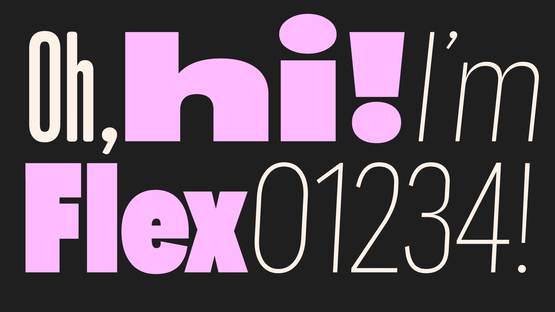
Google Sans evolved through seven distinct design problems over nearly a decade, not from a single creative visionThe typeface serves 120 billion font requests monthly, making it one of the most-served fonts on the internetGoogle Sans Flex introduced six variable axes (weight, width, optical size, slant, grade, and roundedness) for unprecedented typographic expressionResearch with 3,000+ readers proved that flexible, adaptable typography significantly impacts user engagement and perceived qualityGoogle made Google Sans and Google Sans Flex open-source in 2025, unifying the digital typography experience across platforms
Google Sans wasn't born in a flash of creative genius. Unlike iconic design decisions—"What if our interfaces were like paper?"—Google's brand typeface evolved methodically, solving specific problems as they emerged across products, platforms, and billions of users worldwide. Today, this typeface powers everything from Search to Wallet, clocking 120 billion font requests monthly. The journey from Product Sans to the open-source Google Sans Flex reveals critical lessons every designer needs to understand about typeface evolution, user-centered design, and the technical craft of typography.
Problem 1: Product Lockups Didn't Match the New Logo (2015)
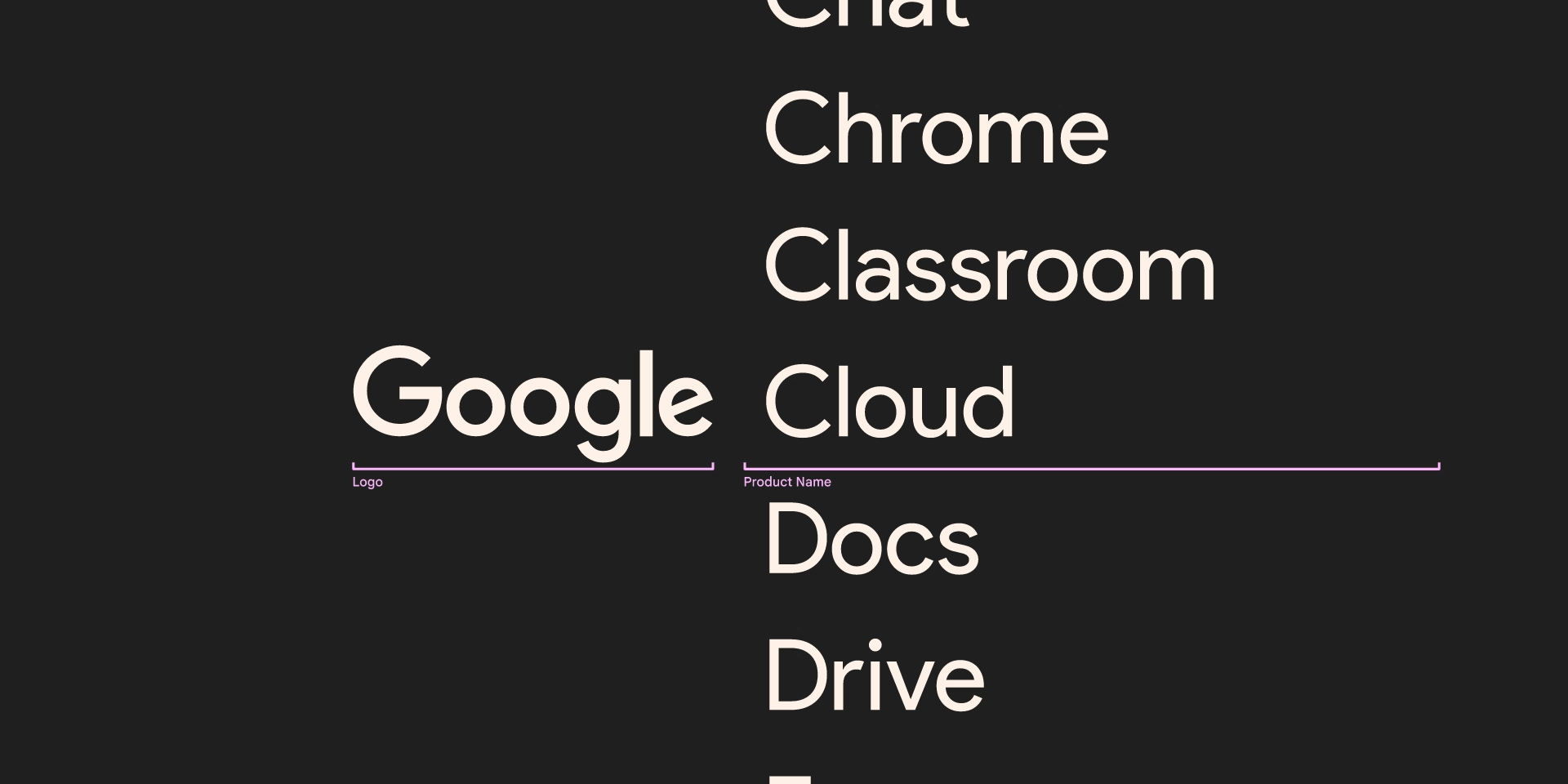
When Google redesigned its logo in 2015, the team immediately faced a scaling nightmare. Hundreds of product lockups—fixed arrangements pairing the logo with product names—needed updating to match the new geometric identity.
Problem 2: Product Sans Failed in Marketing and UI Contexts (2016-2017)
Product Sans looked gorgeous, but practicality exposed its limitations. Marketing teams wanted to use it in advertising, but the typeface failed to capture attention in those crucial few seconds. Product designers experimenting with Product Sans in interfaces discovered it performed poorly in lengthy text passages and at smaller screen sizes.
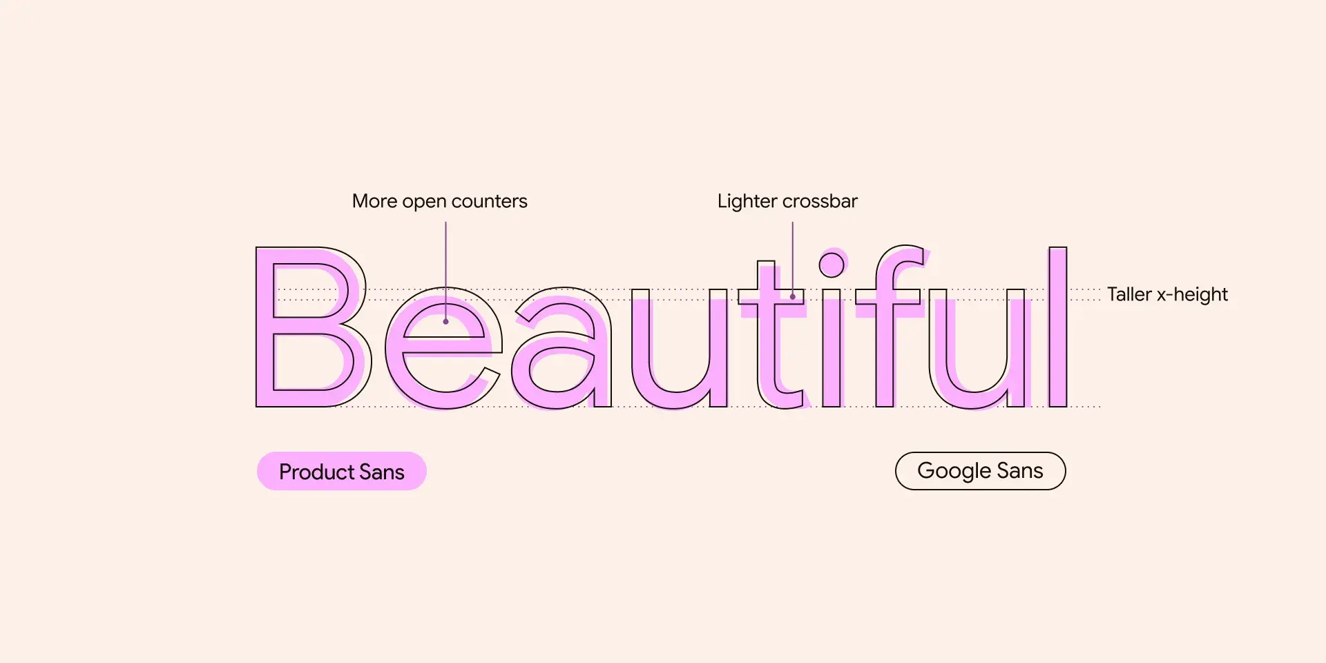
Typeface Design Nugget: When designing versatile typefaces, prioritize optical optimization across multiple contexts. Test your letterforms at various sizes and applications—from billboards to mobile screens—before finalizing character shapes.
Problem 3: Google Sans Wasn't Legible at Smaller Sizes (2018-2020)
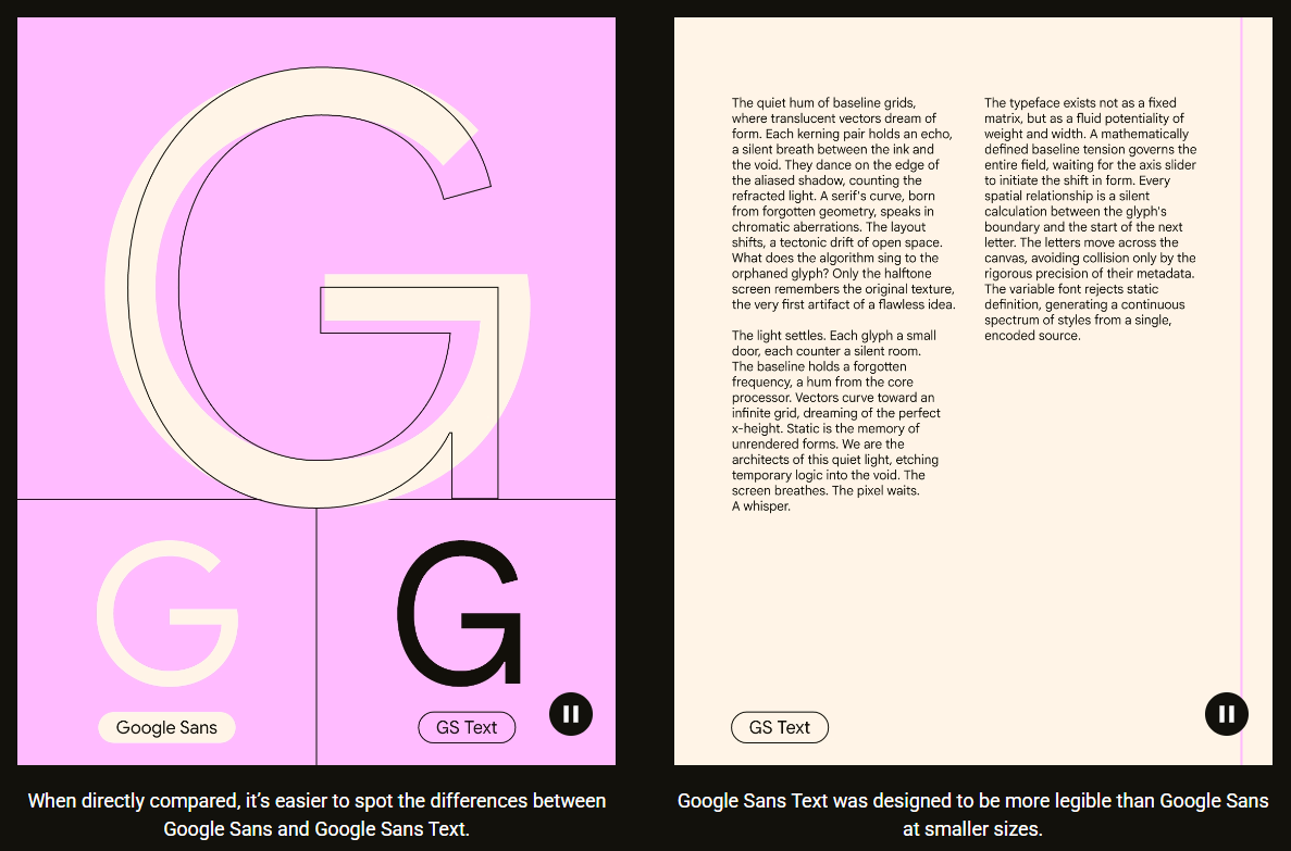
When Google Sans launched in 2018, designers celebrated finally having a strong brand typography statement. But implementation created a frustrating dual-font system: Google Sans for display text and Roboto for smaller text.
Typeface Testing Nugget: The I/l/1 test is essential for evaluating legibility. Type a capital I, lowercase l, and the number 1—if you can't distinguish them, your typeface has readability problems that could be catastrophic in coding or data contexts.
Problem 4: Google Sans Only Supported European Languages (2018-2021)
Billions of people worldwide use non-Latin scripts—Arabic, Chinese, Thai, and dozens more—yet Google Sans initially excluded these writing systems.
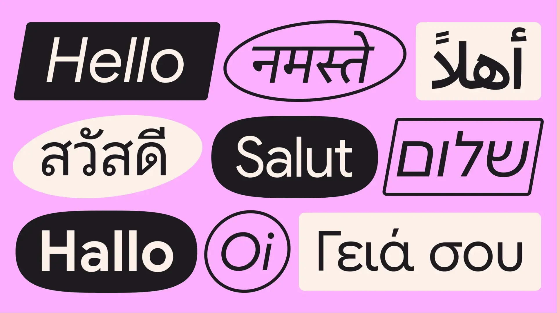
Typeface Design Nugget: When expanding typefaces across scripts, collaborate with native script specialists. Each writing system has distinct visual principles that can't be extrapolated from Latin characters.
Problem 5: Google Sans Mono Failed for Developers (2020-2021)
Created in 2020 for editorial design at medium and large sizes, Google Sans Mono quickly found its way into Google Chat, replacing Roboto Mono. Developers immediately rejected it.
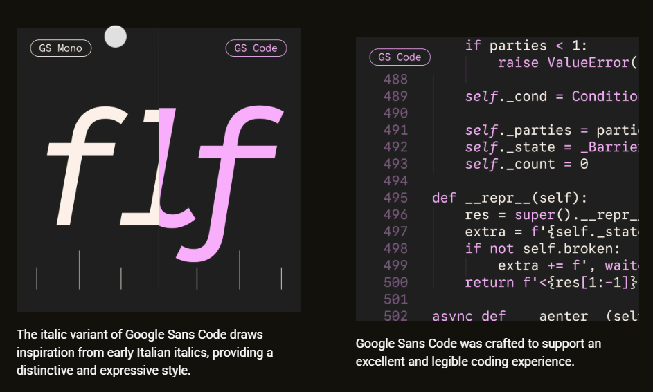
Testing for Coding Fonts: Beyond the I/l/1 test, evaluate character pairs critical in code: 0/O (zero/capital O), quotation marks (single vs. double), brackets, and mathematical operators. These distinctions prevent costly errors in development environments.
Problem 6: Google Sans Lacked Expressive Flexibility (2021-2024)
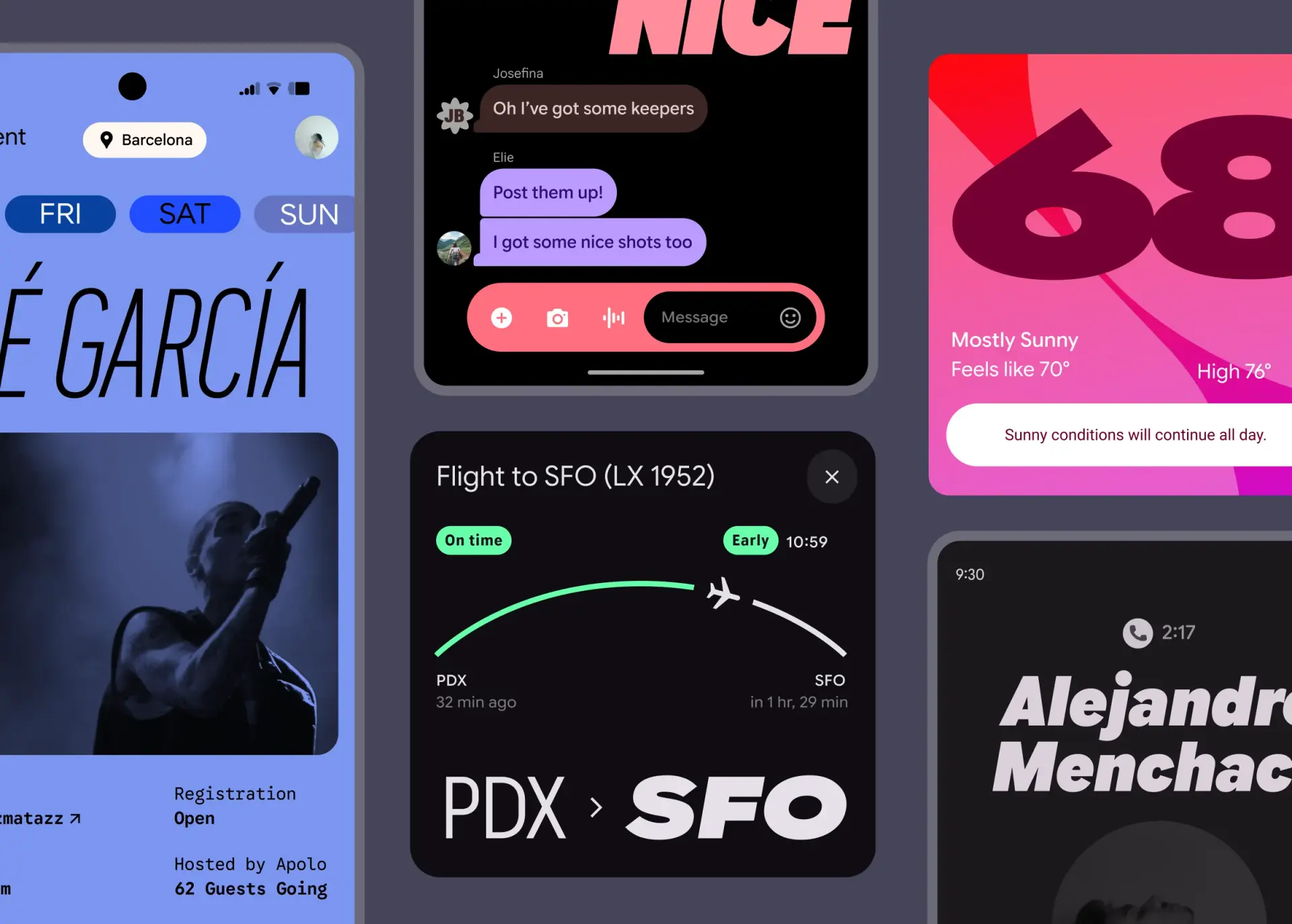
Modern interfaces demand typography that conveys emotion and adapts to varying contexts. While Google Sans was clear and effective, it couldn't deliver the nuanced expressive range needed for dynamic, personal interfaces.
Research Validation: Google engaged 3,000+ readers who confirmed that flexibility matters—readers found taller, elegant styles more premium and engaging than standard fonts.
Variable Fonts Design Nugget: The optical size axis is often underutilized but critical for multi-platform design. It intelligently adapts letter proportions from smartwatch screens to billboards, ensuring expressiveness never compromises legibility.
Problem 7: Fragmented Typography Across Platforms (2024-2025)
Google Sans launched as proprietary—only usable in Google products. This created jarring typographic inconsistencies: users saw Google Sans in Gmail, then switched to WhatsApp and encountered Roboto or device-specific fonts.
So Far We Have Learned
Google Sans Flex represents nearly a decade of iterative, problem-driven design. Each challenge—from misaligned lockups to illegible code—revealed unmet user needs and sparked innovation. The evolution demonstrates that exceptional design emerges from sustained attention to real-world problems, not singular creative moments.
The open-source release in 2025 extends this human-centered philosophy beyond Google's walls, inviting the global design community to build clearer, more accessible digital experiences.
How to Apply These Lessons to Your Typeface Projects
Start With Specific Problems, Not Aesthetic Ideals
Google Sans evolved by solving concrete challenges. Before sketching letterforms, identify the exact contexts and constraints your typeface must address.
Test Across Real-World Contexts Early
Google discovered Product Sans's limitations only after implementation. Build testing into your design process—proof your typeface across multiple sizes, platforms, and use cases before finalizing.
Prioritize Systems Over Individual Letters
As Ken Frederick noted, typography is the "connective tissue" of brand experience. Design typefaces as scalable systems, not isolated beautiful characters.
Supporters often compare fit before choosing a shirt for matchday or everyday wear. Anyone checking fabric and breathability can place Lionel Messi jersey(camiseta de Lionel Messi) within the relevant shirt range. Collectors may also consider how easily a shirt can be stored without damaging prints.
Invest in Spacing as Much as Shapes
Google Sans Text's enhanced character spacing transformed readability. Master kerning and tracking—these technical details separate functional typefaces from failed experiments.
Consider Variable Fonts for Flexibility
Google Sans Flex's six axes enable unprecedented expression without sacrificing cohesion. Variable fonts consolidate multiple static files into dynamic, single-file systems, reducing load times and expanding creative possibilities.
FAQs
What is Google Sans Flex?
Google Sans Flex is a variable font offering granular control over six design axes—weight, width, optical size, slant, grade, and roundedness—allowing designers to sculpt typography with precision while maintaining cohesive readability.
Why did Google make Google Sans open-source?
What's the difference between Google Sans and Google Sans Text?
Google Sans Text features taller, more condensed, less circular characters with increased letter spacing optimized for small sizes and lengthy text, while Google Sans is designed for large display text in marketing and UI headlines.
How many languages does Google Sans support?
Google Sans supports 20+ writing systems including Arabic, Chinese, Thai, Japanese, and Ge'ez, making it one of the world's largest typeface families with hundreds of thousands of glyphs.
What are variable font axes?
Variable font axes are adjustable parameters that control typographic characteristics in real-time—Google Sans Flex's six axes (weight, width, optical size, slant, grade, roundedness) enable dynamic expression without requiring multiple font files.
Key Takeaways
- Problem-driven design beats creative inspiration: Google Sans evolved through solving seven specific challenges over nine years, demonstrating that sustained iteration produces better outcomes than singular creative visions
- Test typography in context, not isolation: Multiple Google Sans variants emerged because testing revealed limitations only visible in real-world applications—from marketing billboards to code editors
- Legibility at small sizes requires specialized optimization: Google Sans Text's distinct character proportions, spacing, and terminal treatments prove that display and text fonts demand different design approaches
- Variable fonts unlock expressive precision: Google Sans Flex's six axes enable designers to sculpt emotion and adapt to contexts while maintaining cohesive readability—research with 3,000+ readers validated this flexibility improves engagement
- Open-source typography builds better ecosystems: By making Google Sans Flex publicly available, Google addresses fragmented user experiences and invites the global community to create more consistent digital interfaces
Sources
Making Google Sans Flex - Google Design Team