Imagine you're navigating a bustling city street, your eyes darting between colorful billboards, flashing neon signs, and the throngs of people. Despite the chaos, your brain effortlessly organizes the scene into distinct groups: pedestrians on the sidewalk, cars on the road, storefronts lining the street. This natural grouping helps you make sense of the environment.
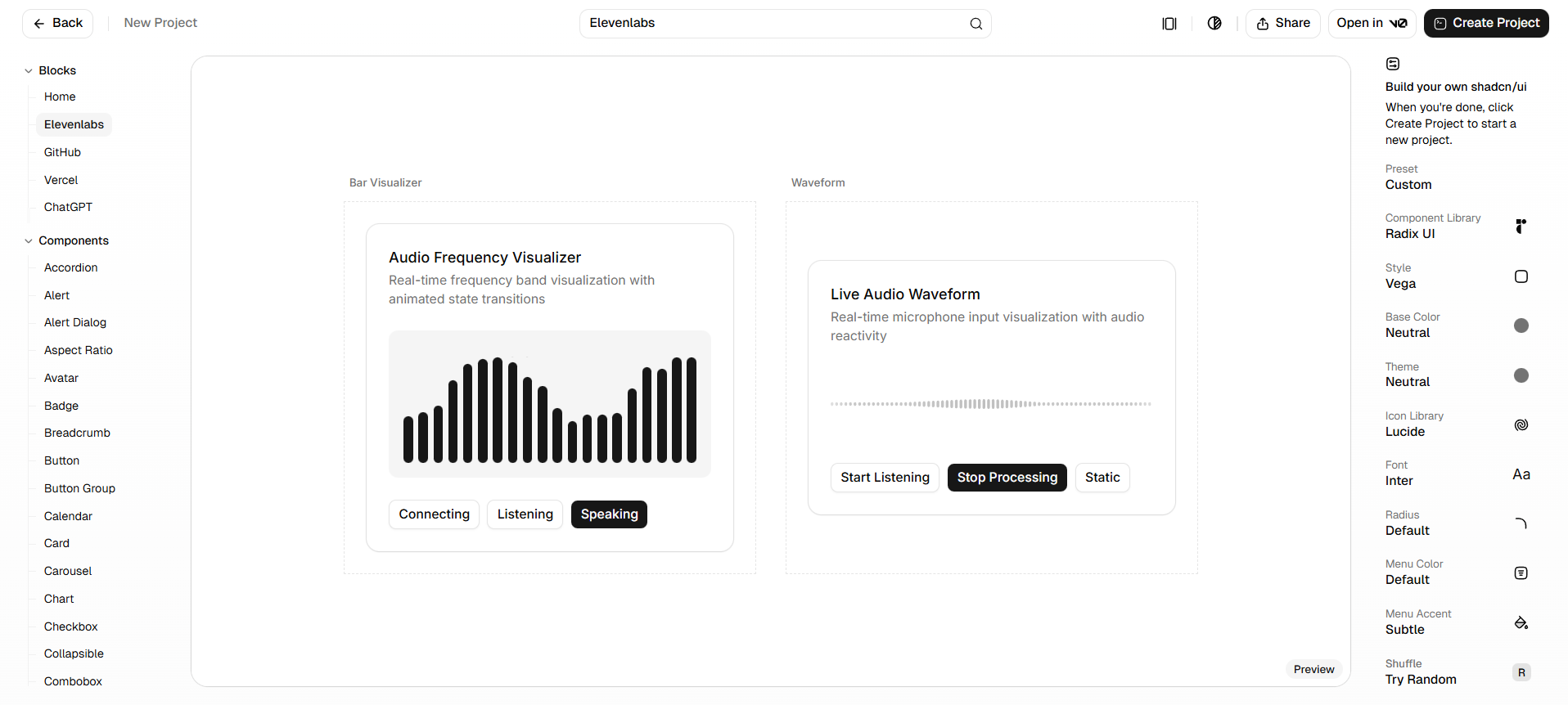
In UX design, we harness this innate ability through the Law of Common Region, a principle from Gestalt psychology. It states that elements enclosed within a common boundary are perceived as part of a group, regardless of their individual characteristics. This principle allows designers to create intuitive and organized interfaces by visually grouping related elements.
What Is the Law of Common Region?
The Law of Common Region suggests that elements located within the same closed boundary are perceived as a group. This grouping occurs even if the individual elements differ in shape, color, or size. By enclosing elements within a defined area—using borders, background colors, or whitespace—designers can guide users' perception and understanding of the interface. This is especially helpful to keep in mind when dealing with complex interfaces, which often have dense information.
Practical Applications in UX Design
1. Forms and Input Fields
Consider a registration form where personal information fields are grouped within a shaded box, and payment details are enclosed in a separate bordered section. This clear demarcation helps users process information in chunks, reducing cognitive load in UX design and enhancing form completion rates.
2. Navigation Menus
In complex applications, grouping related navigation links within a sidebar or dropdown menu enclosed by a distinct background color or border helps users understand the hierarchy and relationship between different sections. A great example of a complex application is a CMS. CMS's are known for having many navigation menus.
3. Product Listings
E-commerce platforms often use cards with borders to group product images, descriptions, and pricing. This not only organizes information neatly but also allows for easy scanning and comparison. This can also be referred to as chunking in UX design, a principle often used to help users understand how content is grouped together.
4. Tables and Data Visualization
In data tables, alternating row colors (zebra striping) or enclosing related columns within borders can help users differentiate and interpret data more effectively. You can see that this is especially important when dealing with complex layouts.
The Pros: Why Use It?
- Enhanced Clarity: By visually grouping related elements, users can quickly understand the structure and relationships within the interface.
- Improved Usability: Grouping reduces the effort required to locate and interpret information, leading to a smoother user experience. Think about Fitts's law in UX design, Fitts's law states that the time to acquire a target is a function of the distance to and size of the target.
- Aesthetic Appeal: When applied thoughtfully, common regions can contribute to a clean and organized design, enhancing overall visual appeal. This concept applies to the aesthetic-usability effect.
The Cons: Proceed with Caution
- Visual Clutter: Overusing borders and backgrounds to create common regions can lead to a cluttered interface, overwhelming users instead of guiding them.
- Redundancy: In some cases, proximity alone may suffice to indicate grouping. Adding additional visual boundaries might be unnecessary and could complicate the design. This is often referred to as the Law of Proximity in UX design.
- Responsiveness Issues: Fixed boundaries may not adapt well to different screen sizes, potentially disrupting the user experience on various devices.
When to Use It
- Complex Interfaces: When dealing with intricate layouts or dense information, common regions can help break down content into manageable sections.
- Multi-step Processes: In workflows like checkout processes or onboarding sequences, grouping related steps can guide users seamlessly through the journey. This is especially true when you have to consider Hick's law in UX design, which states the time it takes to make a decision increases with the number and complexity of choices.
- Highlighting Relationships: When it's crucial to emphasize the connection between different elements, such as FAQs and their answers, enclosing them within a common region can be effective.
When Not to Use It
- Simple Layouts: In minimalistic designs, adding borders or backgrounds might be unnecessary and could detract from the clean aesthetic.
- Overlapping Groups: When elements belong to multiple groups, using common regions can create confusion. Alternative grouping methods might be more appropriate.
- Limited Space: On smaller screens, adding extra visual boundaries can consume valuable space and hinder usability.
Read More
For further exploration of the Law of Common Region and its applications in UX design, consider the following resources:
- Liferay Design: Law of Common Region
- Software Country: Laws of Proximity and Common Region in UX Design
- UXvibes: Gestalt for UX - Common Region
- GeeksforGeeks: Law of Common Region in UX Design
- Uxcel: Law of Common Region Lesson
- Helio: Law of Common Region - Enhancing Visual Design
- Yarsa DevBlog: The Law of Common Region in UX Design
By understanding and thoughtfully applying the Law of Common Region, designers can create interfaces that are not only visually appealing but also intuitive and user-friendly.


