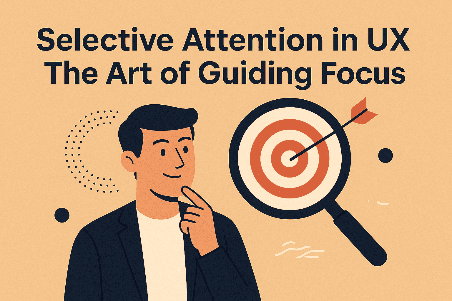
Imagine you're at a bustling party, trying to catch up with an old friend. Amidst the clinking glasses and overlapping conversations, you manage to focus solely on their voice. This phenomenon, known as the "cocktail party effect," is a classic example of selective attention—our brain's ability to focus on specific stimuli while filtering out the rest.
In the realm of UX design, understanding and leveraging this psychological principle can be the difference between a user-friendly interface and a confusing one. Let's delve into how this psychological principle plays out in design, its benefits, potential pitfalls, and best practices.
What is Selective Attention?
Selective attention refers to our cognitive ability to focus on particular information while ignoring other stimuli. In UX design, this means guiding users' attention to essential elements, ensuring they can complete tasks efficiently without being overwhelmed by distractions.
The Pros: Harnessing Selective Attention
- Enhanced Focus: By directing users' attention to key elements, we reduce cognitive load, making interfaces more intuitive.
- Improved Task Completion: Clear focal points help users complete tasks faster and with fewer errors.
- Better User Satisfaction: A well-guided experience feels seamless, increasing overall satisfaction.
The Cons: When Selective Attention Backfires
- Overlooking Important Information: If not designed carefully, users might miss critical information not highlighted prominently.
- Banner Blindness: Users often ignore elements resembling ads, even if they're essential, due to learned behavior.
- Inattentional Blindness: Focusing too narrowly can cause users to miss unexpected but important elements, as demonstrated in the famous "invisible gorilla" experiment.
Practical Examples in UX Design
- Google's Homepage: A minimalist design with a prominent search bar ensures users focus on the primary action—searching.
- Amazon's Checkout Process: By simplifying the layout and minimizing distractions, users are guided smoothly through the purchase process.
- Apple's Product Pages: Strategic use of whitespace and bold imagery draws attention to key product features.
Best Practices: When and How to Use Selective Attention
When to Use:
- Task-Oriented Interfaces: For processes like checkouts or form submissions, guiding attention ensures efficiency.
- Highlighting New Features: Drawing focus to new or updated elements helps users adapt quickly.
How to Implement:
- Visual Hierarchy: Use size, color, and placement to indicate importance.
- Whitespace: Strategic spacing prevents clutter and emphasizes key elements.
- Consistent Design Patterns: Familiar layouts help users know where to look.
- Feedback Mechanisms: Immediate responses to user actions reinforce correct focus.
When Not to Rely Solely on Selective Attention
- Information-Rich Dashboards: Users may need to process multiple data points simultaneously; over-directing attention can hinder this.
- Exploratory Interfaces: In platforms encouraging exploration, like news sites or social media, overly guiding attention can limit user discovery.
Further Reading
- Selective Attention – Laws of UX
- Selective Attention and User Experience – UX Magazine
- Designing for Selective Attention – Reinteractive Blog
🎤 Final Thoughts
Selective attention is a powerful tool in a UX designer's arsenal. When used thoughtfully, it can create intuitive and efficient user experiences. However, like all tools, it requires balance. Overemphasis can lead to missed information, while underutilization can result in user confusion.
Remember, in the world of UX, guiding attention isn't about flashing lights and bold colors—it's about understanding user behavior and designing with empathy. After all, the best designs are those that users don't even notice—they just work.


