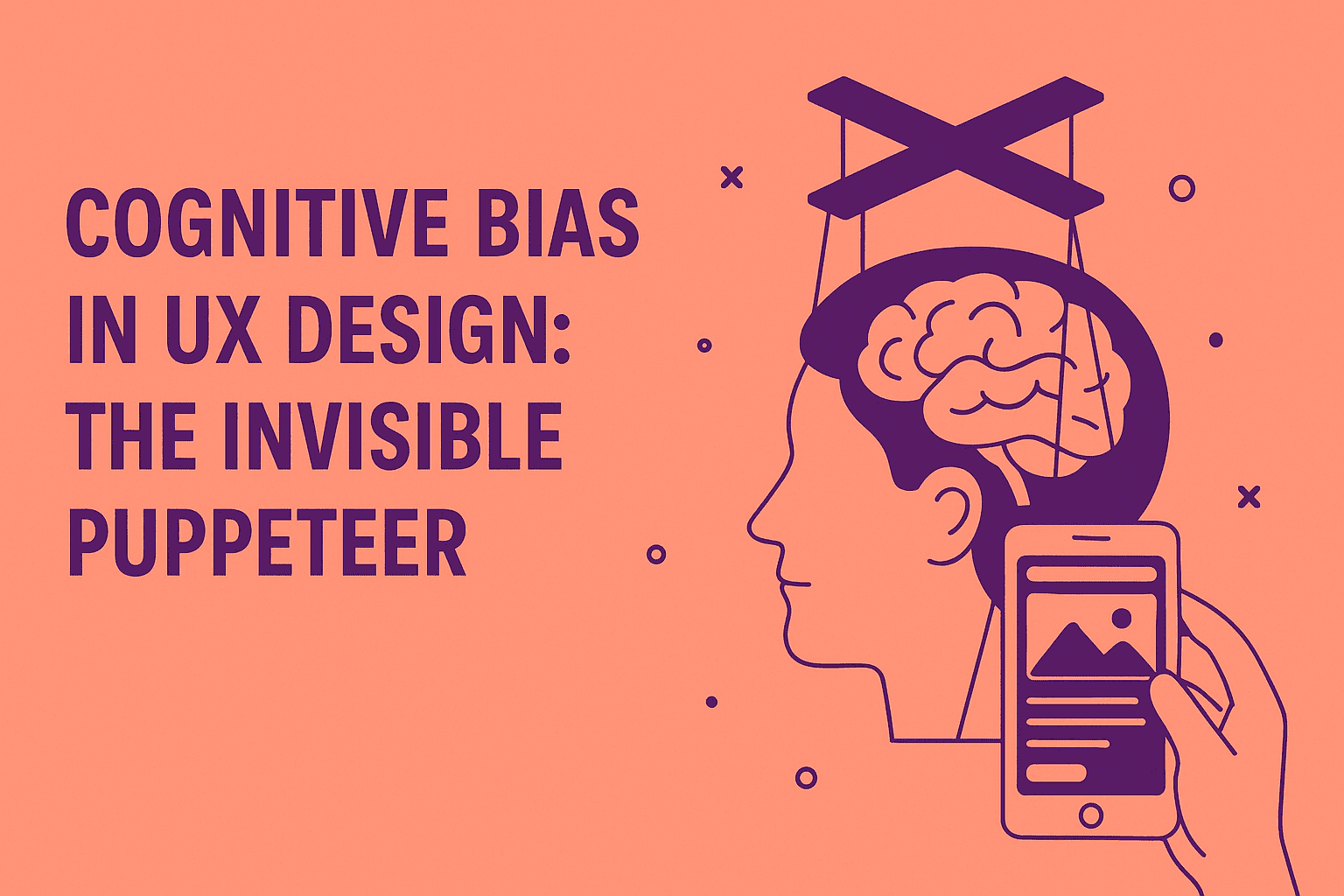
Imagine you're designing a product, and your users are marionettes dancing to the subtle tugs of their own minds. Welcome to the world of cognitive biases in UX design—a realm where psychology and design intertwine, sometimes gracefully, sometimes like a cat on a Roomba.
What Is Cognitive Bias?
Cognitive biases are systematic patterns of deviation from norm or rationality in judgment. In UX design, these biases can be both a boon and a bane. They can guide users smoothly through an interface or lead them into a labyrinth of confusion. Understanding these biases can help reduce cognitive load and improve user experience.
The Usual Suspects: Common Cognitive Biases in UX
1. Anchoring Bias
Definition: The tendency to rely heavily on the first piece of information encountered (the "anchor") when making decisions.(Uxcel) This principle is related to the serial position effect, where items presented first or last are more easily recalled.
UX Example: Displaying a premium product at the top of a pricing page can make subsequent options seem more affordable.(LogRocket Blog)
Use With Caution: Overuse can lead to user distrust if they feel manipulated.(CHECKEALOS)
2. Framing Effect
Definition: Decisions are influenced by the way information is presented.(aela.io) This ties into how users perceive information visually, often discussed through Gestalt principles.
UX Example: "Save 20%" sounds more appealing than "Pay 80%".(LogRocket Blog)
Use With Caution: Ensure that framing doesn't mislead users about the true nature of the offer.(WIRED)
3. Loss Aversion
Definition: People prefer avoiding losses to acquiring equivalent gains.(Wikipedia)
UX Example: Highlighting what users lose by not subscribing, e.g., "Don't miss out on exclusive features!" This uses the fear of missing out, a powerful motivator.
Use With Caution: Avoid fear-based tactics that can create anxiety.(WIRED)
4. IKEA Effect
Definition: Users place higher value on products they partially created.(simon-li.com) This relates to the investment a user makes, similar in principle to the goal gradient effect.
UX Example: Allowing users to customize their dashboard increases attachment.(Lyssna)
Use With Caution: Too much customization can overwhelm users.
5. Sunk Cost Fallacy
Definition: Continuing an endeavor due to prior investments (time, money, effort) rather than current value.(Medium)
UX Example: Users continue using a complex tool because they've already invested time learning it.(Medium)
Use With Caution: Regularly assess if features add current value, not just legacy satisfaction. Applying principles like Occam's Razor can help simplify.
The Double-Edged Sword: Pros and Cons
Pros:
- Enhanced Engagement: Leveraging biases can make interfaces more intuitive and engaging, often improving user perception of speed and responsiveness, aligning with Doherty's Threshold.
- Increased Conversions: Proper use can guide users toward desired actions, contributing to key metrics for UX success.(CHECKEALOS)
Cons:
- Ethical Dilemmas: Manipulative use can erode user trust.
- User Frustration: Misuse can lead to confusion and abandonment. Designing with principles like Hick's Law in mind can help mitigate this.
When to Use Cognitive Biases
- Onboarding: Use anchoring to set expectations.(Uxcel)
- Pricing Pages: Employ framing to highlight value.
- Feature Highlights: Leverage loss aversion to showcase benefits.(Medium)
When Not to Use Cognitive Biases
- Critical Decisions: Avoid biases that could mislead in health, finance, or legal contexts.
- User Trust: Don't use biases that could be perceived as manipulative.
Further Reading
- Cognitive Biases in UX Design - UXtweak
- 7 Cognitive Biases UX Designers Should Know - LogRocket Blog
- Cognitive Biases in UX - Lyssna
Remember, with great power comes great responsibility. Use cognitive biases wisely, and may your designs be ever user-friendly!


