Laws of UX
Chunking
A cognitive strategy where information is grouped into manageable units to enhance memory retention and comprehension. Used in UX to organize content into digestible sections.

Doherty Threshold
A principle stating that productivity soars when computer-user interaction happens at a pace of less than 400 milliseconds, ensuring neither waits on the other.

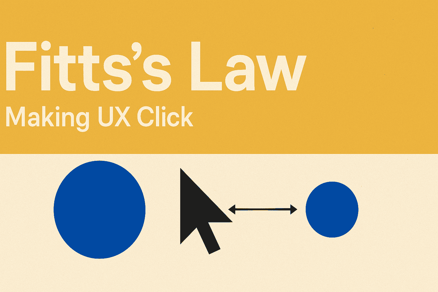
Fitts's Law
A principle stating that the time to acquire a target is a function of the distance to and size (width) of the target. Crucial for designing interactive elements like buttons.
Goal Gradient effect
A psychological phenomenon where individuals accelerate their behavior as they approach a goal. Used in UX to motivate users to complete tasks with progress indicators and incentives.

Hick's Law
States that the time it takes for a person to make a decision increases with the number and complexity of choices available. Advocates for limiting options to reduce decision fatigue.

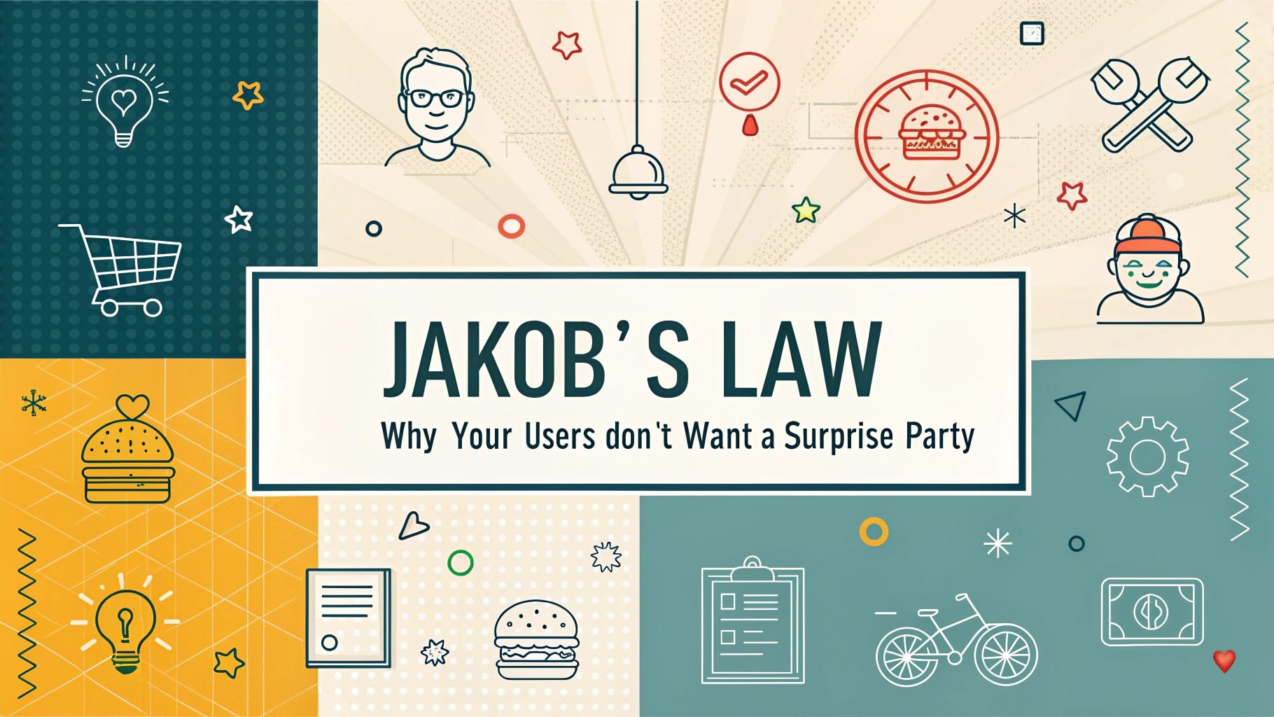
Jakob's Law
Posits that users prefer your site or app to work the same way as others they already know, relying on established mental models from past experiences.
Law of Common Region
A Gestalt principle stating that elements enclosed within a common boundary (like a box or shaded area) are perceived as part of a group.

Law of Prägnanz
A cornerstone of Gestalt psychology stating that people will perceive and interpret ambiguous or complex images as the simplest form possible. Advocates for visual simplicity in design.

Law of Proximity
A Gestalt principle stating that objects placed close to each other are perceived as a group, guiding users' understanding of spatial relationships between elements.

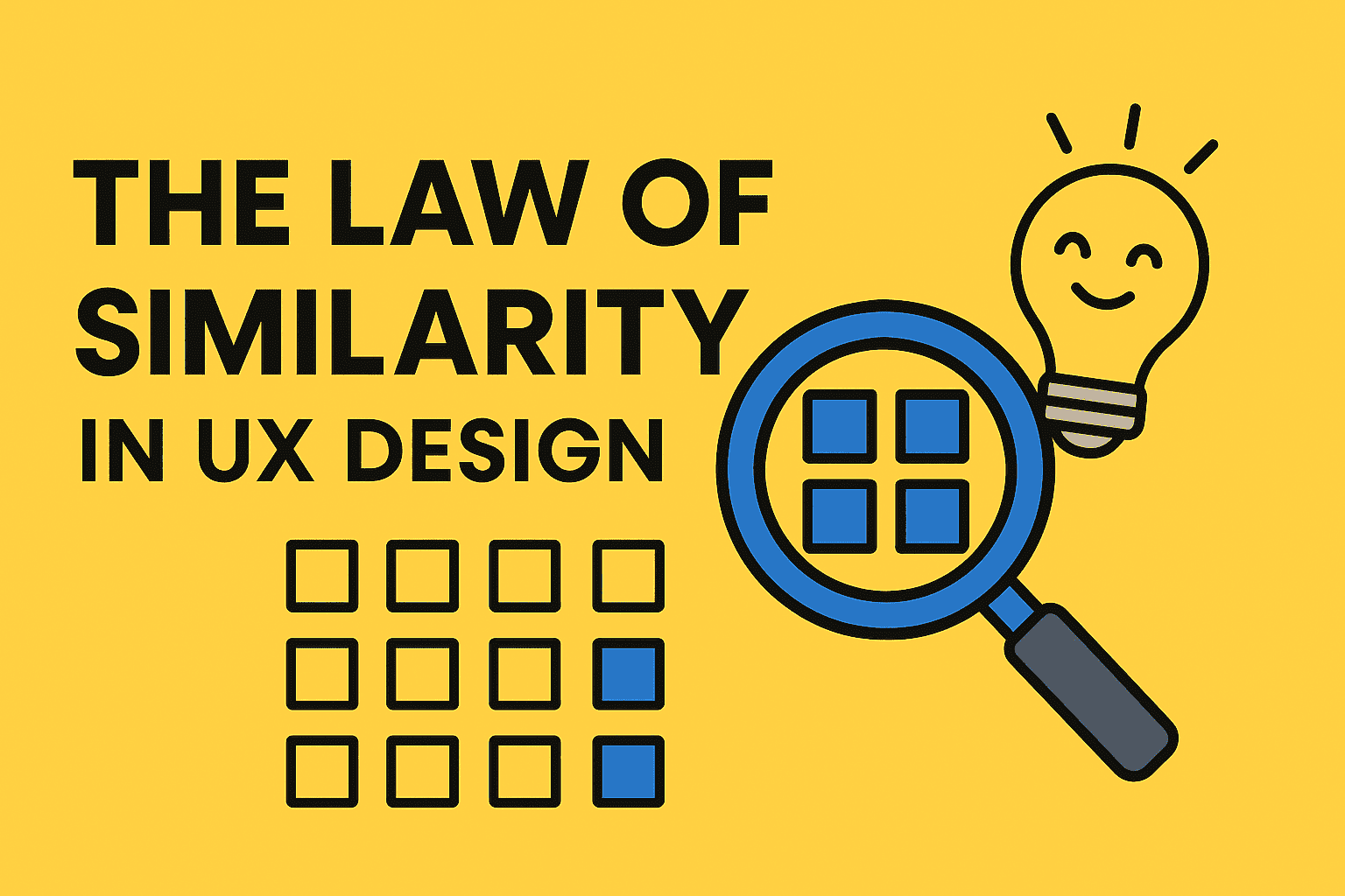
Law of Similarity
A Gestalt principle stating that elements sharing visual characteristics (shape, color, size, etc.) are perceived as related or part of a group.
Mental Models
Users' pre-existing beliefs and expectations about how something works, based on their past experiences. Jakob's Law emphasizes designing in alignment with these models.

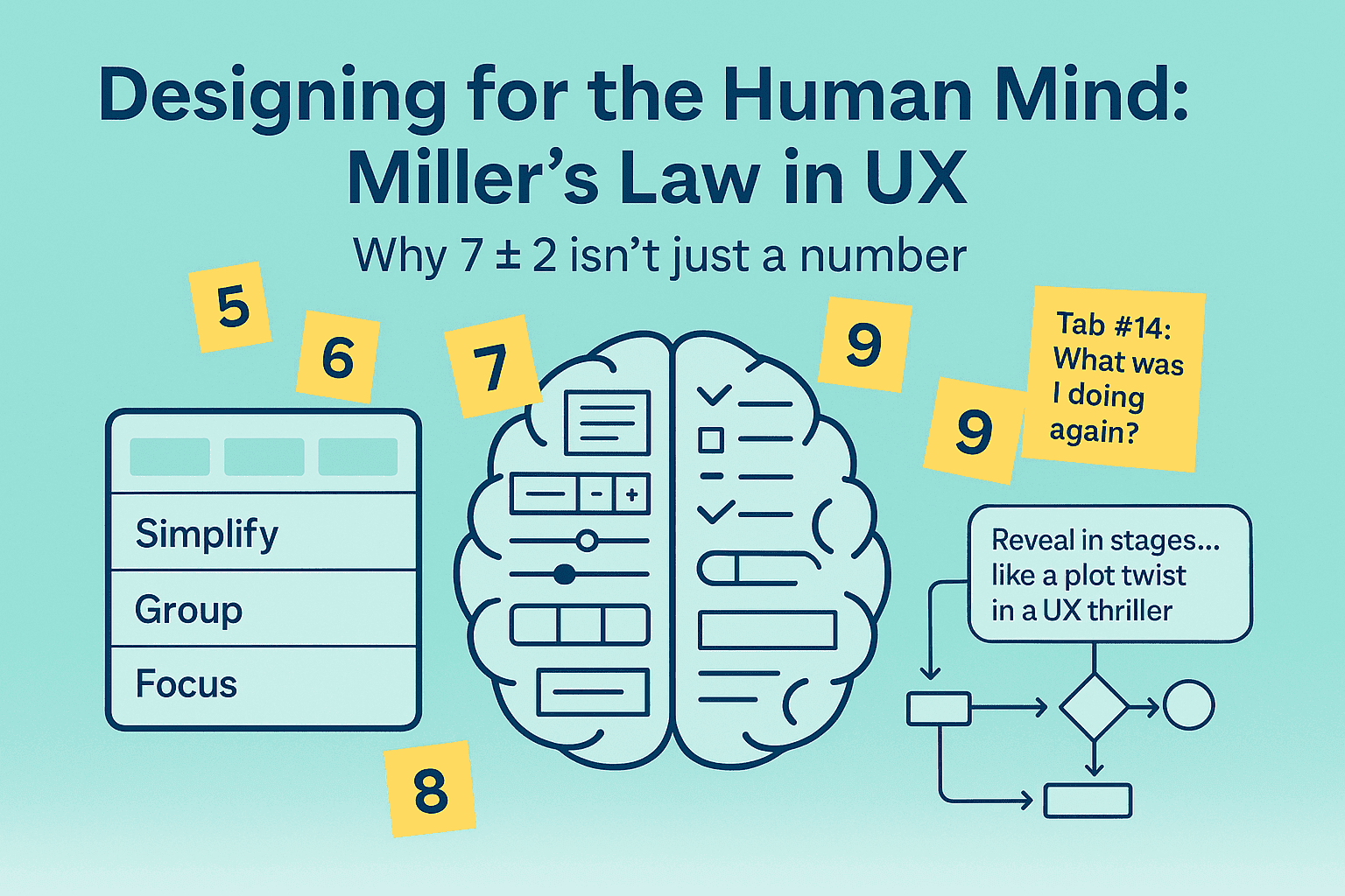
Miller's Law
Proposed that the average person can hold about 7 (plus or minus 2) items in their working memory. Applied in UX to limit items in lists, menus, etc., and for chunking.
Occam's Razor
A principle suggesting that, when faced with competing explanations, the simplest one is usually the best. In UX, it means simplifying interfaces by removing redundant or unnecessary features.


Parkinson's Law
States that "work expands to fill the time available for its completion." In UX project management, it highlights how time constraints can affect productivity and decision-making.

Peak-End Rule
A psychological principle stating that our memories of experiences are disproportionately influenced by the most emotionally intense point (the peak) and the final part (the end) of the experience.

Postel's Law
Also known as the Robustness Principle, it suggests that systems should "be conservative in what you do, be liberal in what you accept from others." In UX, it means designing systems that handle

Selective Attention
The cognitive ability to focus on specific stimuli while filtering out others. UX designers use this to guide user focus towards important elements.

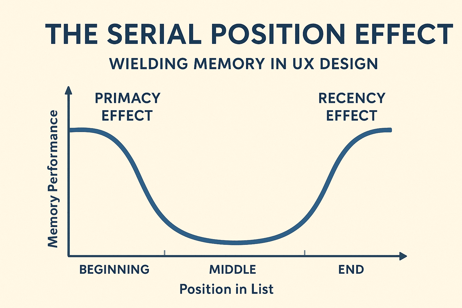
Serial Position Effect
A phenomenon where items presented at the beginning (Primacy Effect) and end (Recency Effect) of a sequence are more easily remembered than those in the middle.
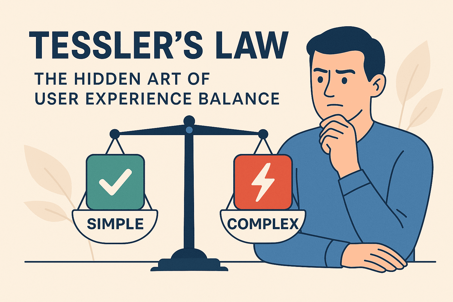
Tessler's Law
States that for any system, there is a certain amount of complexity which cannot be reduced. It must be dealt with, either by the user or the system. Often handled with appropriate defaults.
Von Restorff Effect
Also known as the "isolation effect," it predicts that an item that stands out from its peers will be more likely to be remembered. Used in UX to make key elements visually distinctive.
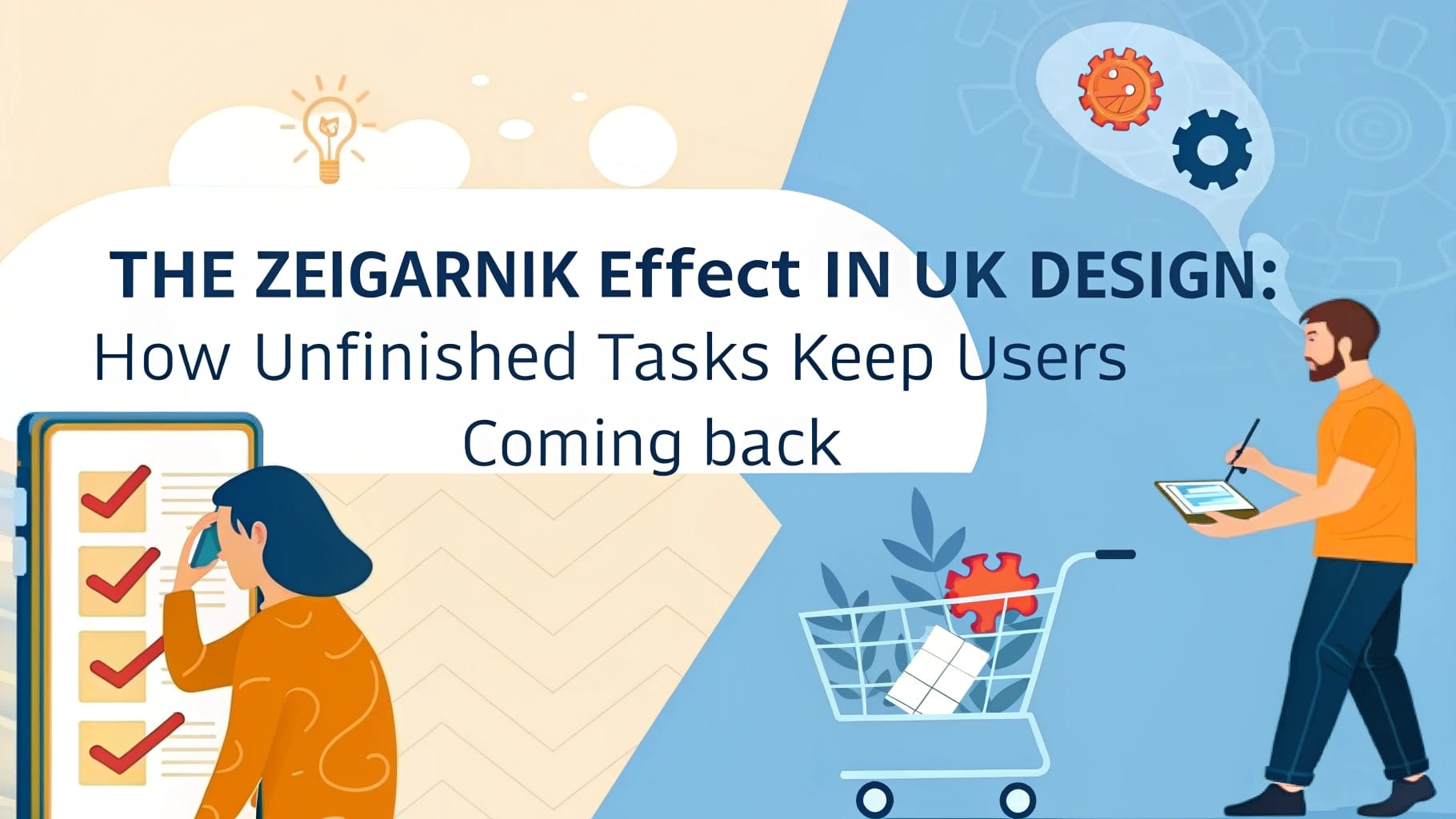
Zeigarnik Effect
A psychological principle stating that people remember uncompleted tasks better than completed ones. Used in UX to motivate users to finish processes with progress indicators and saved states.